Thornhill Fitness
33,000 sqft of premium equipment, recovery amenities, and expert coaching. A full-service gym where Thornhill comes to train.

The Problem
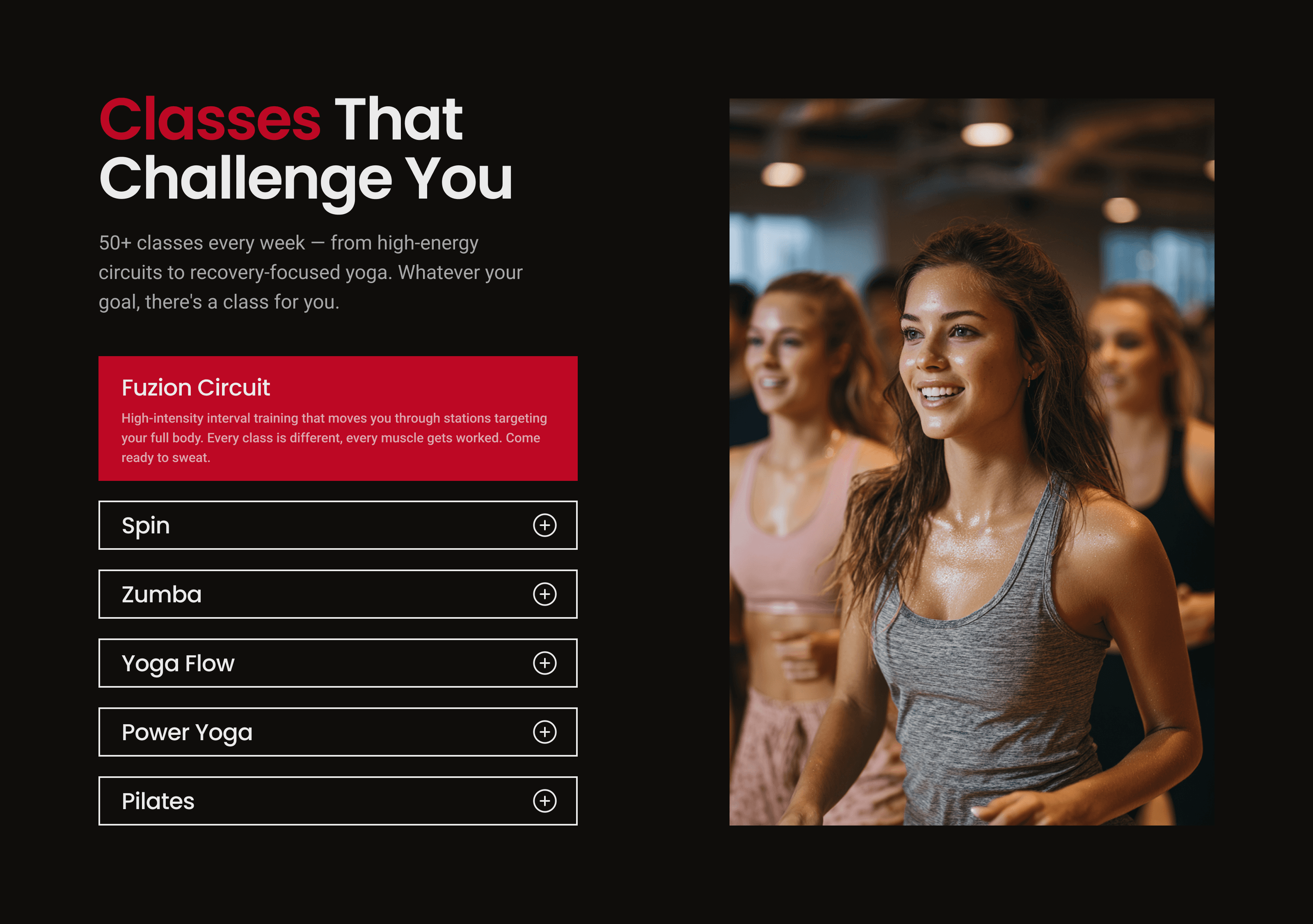
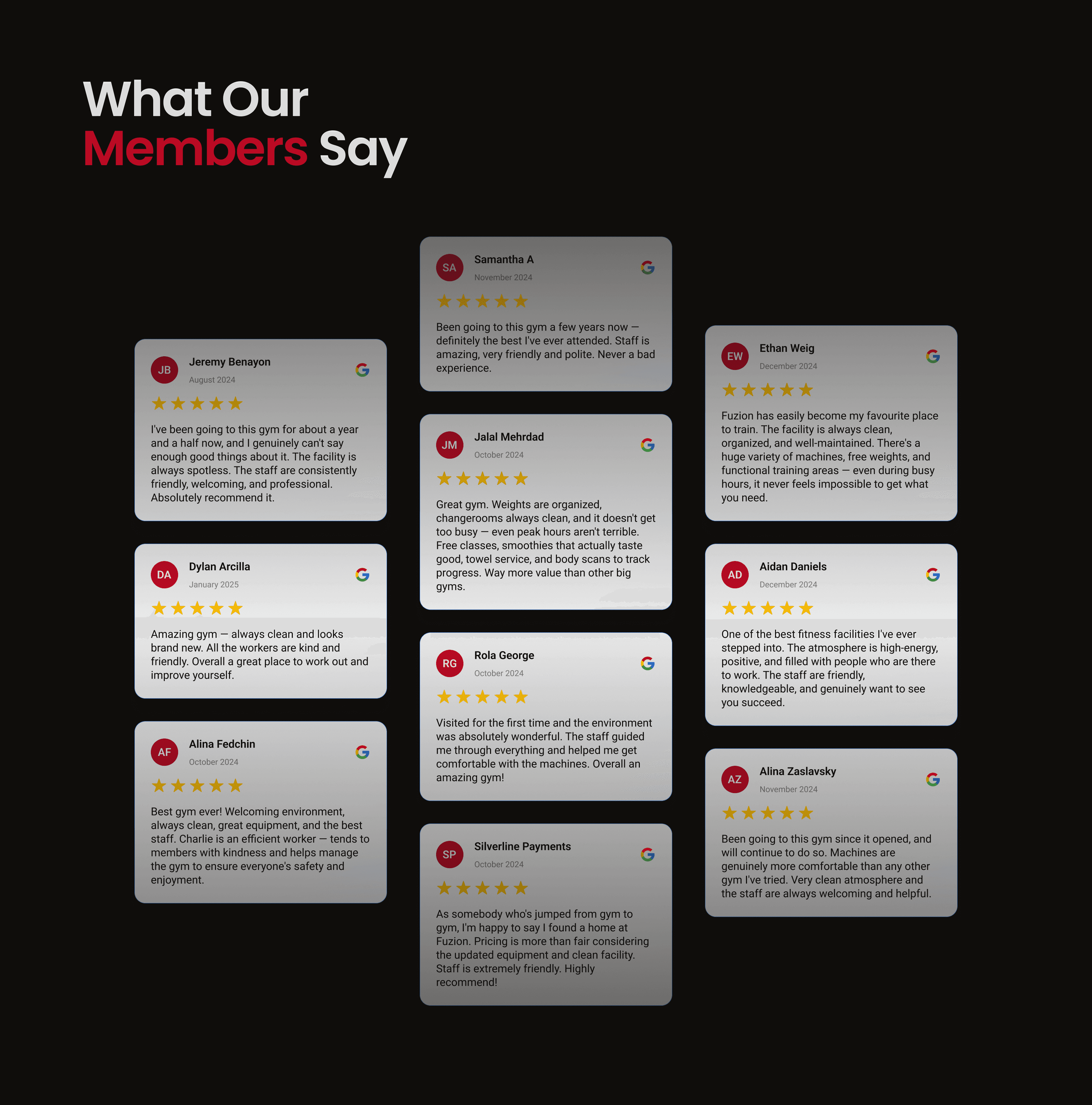
A 33,000 sqft facility with steam rooms, a smoothie bar, group classes, and personal training, all running on a website that looked like a WordPress template from 2012. The hero section led with a discount headline and a 5-field form before visitors even saw what the gym offered. Inconsistent colors, no real photos of the space, and an empty testimonials section that was literally blank. Over 500 Google reviews at 4.6 stars with zero social proof visible anywhere on the site. The class schedule was buried, trainers had no presence, and the amenities that set this gym apart were reduced to a checklist with no images.
The Redesign
The new homepage leads with what makes this gym worth joining, not a discount. A full-width hero with real facility imagery, a benefit-driven headline, and a stats bar showing the review count, facility size, and weekly class volume. A dedicated section highlights what sets the gym apart: the space, the equipment, the recovery amenities. Group classes and personal training each get their own section with real visuals and clear CTAs. Member testimonials pulled from Google reviews are front and center with names, dates, and star ratings. The page closes with a simple free trial form and an updated footer with social links, hours, and all four locations.